
Thursday, February 16, 2012
Visual Texture
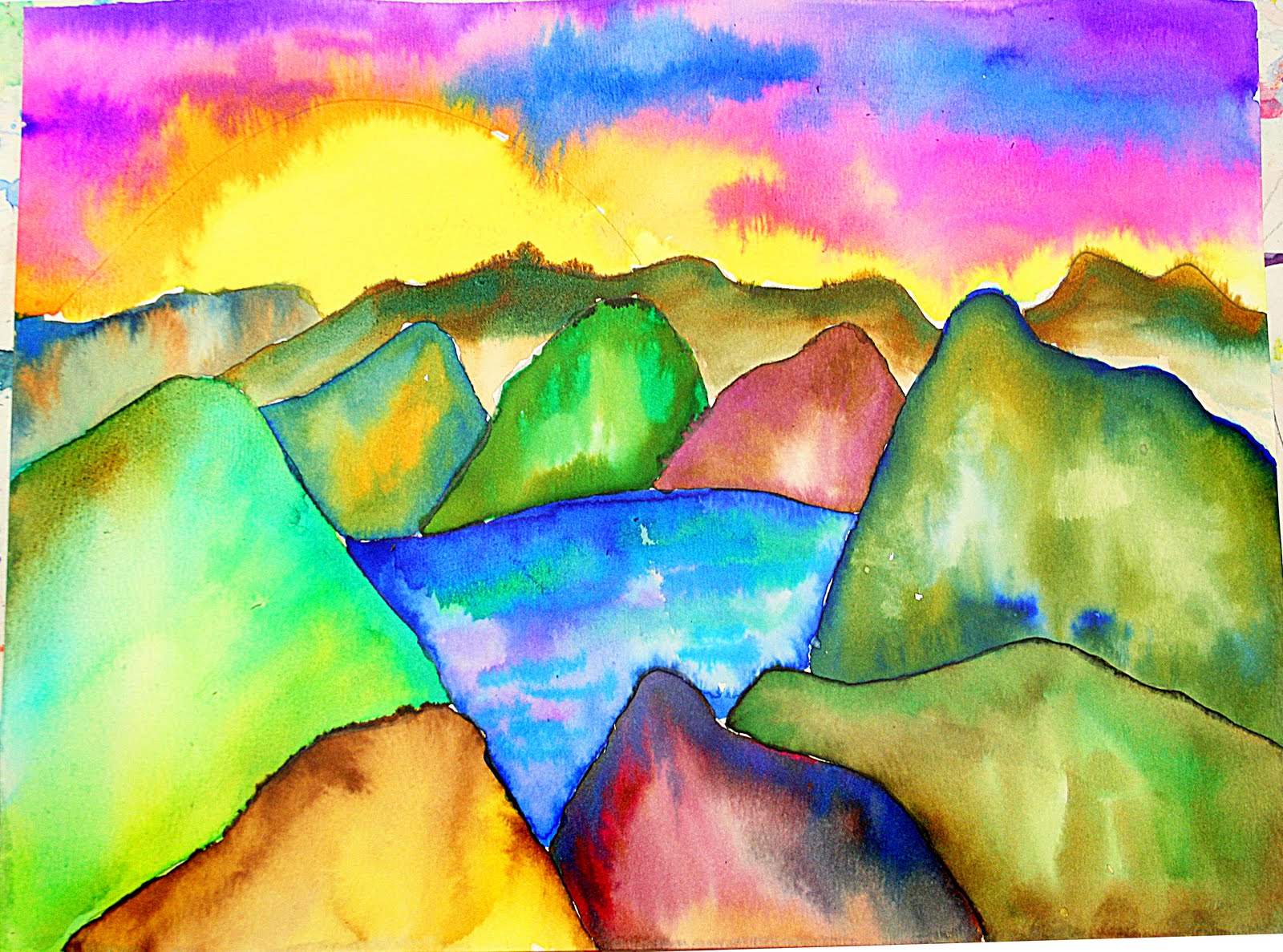
Vivid Mountains
Actual Texture

-Leah
Pattern

-Dana-Lynn
Wednesday, February 15, 2012
John Marchetti

- John Marchetti
Texture and Perspective

Texture

Atmospheric Perspective

AnnMarie Pollock

This piece of art is an example of foreshortening drawn by Laura McGhee. It is foreshortening because it looks like there is depth in the drawing and a difference in how close the girl appears. It looks like her finger touching the bug is very close to the viewer, yet you can tell she is laying down with her body layer out behind her.
-Rose Migliara

--Alexis Swoyer
Tuesday, February 14, 2012
Chop!

This work of art demonstrates foreshadowing in both the butchers arms. The first arm looks as though it is coming at the viewer and off the page, and the second arm looks as though it is behind the body of the butcher. The way his arms are placed and the awesome use of foreshadowing used here gives a great idea of space as well. The eye continuously moves from the “front” of the paper to the “back” of the paper.
Emily
Foreshortening

Implied Space

In this watercolor painting by Margaret Hamlin, there is evidence of implied space by the way the trees are set in the foreground, middleground, and background. In the foreground, the white trees appear to be closer because they are bigger. The trees behind them, in the middleground, appear to be farther away because they are smaller. In the background, there is atmospheric perspective because the trees are barely identifiable and resemble little sticks rather than trees. There is also pattern in this piece in the swirls in what appears to be the yellow sky. Complementary colors are used (red and green) as well.
Atmospheric Perspective

Implied Lines

-Hanzala Jamil
Monday, February 13, 2012
Lines

Waterfall

Lines: M.C. Escher

This was a lithograph by M.C. Escher without a title in 1956. There are lines everywhere in this work. There are directional lines that make a viewer follow the work in a certain way. There are lines that are the edges to shapes. There are lines used to make some geometric shapes, such as circles, squares, etc. There are also actual likes that make the buildings, parts of the ship, etc.
-Tara

"Good Dog!"

Lines

Sunday, February 12, 2012
The Magic of Lines

-Michelle Ketcham
Contour Lines
 This drawing by Tornwing is an exceptional demonstration of use of lines. This entire drawing is made of contour lines of different thickness, darkness, and shape that creates a beautiful drawing when put together. The fact that there is nothing else besides lines put together in this drawing is very interesting because there is no color or anything to make the drawing stand out, yet it is still very good. The lines on the shoes especially give a certain look to them because they are not touching and there is white in between all of them. This gives an interesting look that shows a certain originality that i believe the artist was searching for when they created this drawing. And the fact that the drawing is of a pair of converses I feel as though it helps the viewer relate to the drawing which is a bonus.
Lines, lines, and more lines

The artist Heike Weber displays the use, and power of lines in her installation artwork. by using a permanent marker she draws all over a plain room, covering it from floor to ceiling. In this piece, titled "Utopia" she has used only contour lines to create an awe-inspiring piece of art. This example displays the importance of line and how it can be used to really define a piece.
Focus on Line: Woman with a Parasol

Woman with a Parasol is an oil painting by Claude Monet.
Monet used contour lines in the distinct geometric shape of a large triangle in painting the woman (his wife) and a smaller triangle in the image of his son. The parasol's underside is also made up of triangles in a circular fashion. These lines are darker for the shadowing effect. The contour lines of her dress are dark, drawn diagonally to show the shadowing of the parasol from the sun overhead. Short vertical lines make up the grassy area below her. The soft, cool colors used for the clothing of the woman blends with the negative space of the sky behind her. There is an additional patch of yellow on the arm of the woman, also in the shape of a triangle.
Eileen
Lines, Lines and More Lines

Subscribe to:
Posts (Atom)